SMRT In-train
Screen Redesign
PROJECT OVERVIEW
In collaboration with another designer, we set out to redesign the MRT in-train screens to better serve commuter needs. While existing screens displayed various forms of information, their usability was often criticised for poor readability, irrelevant content, and confusing presentation — issues well-documented by local media and commuters alike.
THE CHALLENGE
Lack of prioritisation: Important details like current location, next stop, and line changes were buried among irrelevant visuals such as landmark photos.
Readability issues: Thin, all-caps typefaces on busy or dark backgrounds made information hard to read, even at short distances.
Ineffective visual hierarchy: Station “dots” were visually larger than station names, and some stations displayed without names entirely.
Cognitive overload: Detailed station blueprints flashed for only a few seconds, making them impossible to interpret on time.
Disconnection from other systems: The visual style didn’t align with SMRT’s established signage and branding, creating inconsistency.
Missed context: Key operational information like door side or disruptions was either unclear or overshadowed by animations.
OUR GOAL
Create a design that delivers essential information clearly, supports commuter wayfinding, and aligns with SMRT’s visual identity.
MY ROLE
Conducted research to identify improvement opportunities, including benchmarking in-train displays from Japan, UK, and Taiwan.
Observed commuter behaviours and carried out user interviews and contextual inquiries to uncover pain points.
Collaborated with another designer to design improved screen layouts, incorporating universal pictograms for clearer communication.
Created motion prototypes to demonstrate screen interactions and purposeful animations.
EXPERTISE
User Research (user interviews & contextual inquiry)
Design & Animation
APPROACH
Contextual Inquiry & Heuristic Evaluation
We rode the North-South Line, observing commuter behaviour and testing the screens against Nielsen’s 10 usability heuristics. We noted where passengers looked, how passengers react to the screens, and how readable and usable the screens actually were.
User Interviews
We conducted six interviews with both locals and tourists. This helped uncover:
Commuters’ primary needs: knowing where they are now and how far to their destination.
Irrelevance of landmark imagery, even for tourists who already planned trips using other sources.
A tendency to rely on printed maps or announcements over screens when clarity was lacking.
Problem Framing
We grouped our findings into core issues:
Relevance: Eliminate non-essential info that distracts from immediate needs.
Clarity: Present key wayfinding details at a glance.
Consistency: Align with SMRT’s established branding and typefaces.
What we learned
From our contextual inquiry and user interviews, several key pain points emerged
Major Issues
Information continuity and clarity
Critical way-finding details, such as current station, upcoming stops, and distance to destination, were not always presented in a continuous, easy-to-read format.
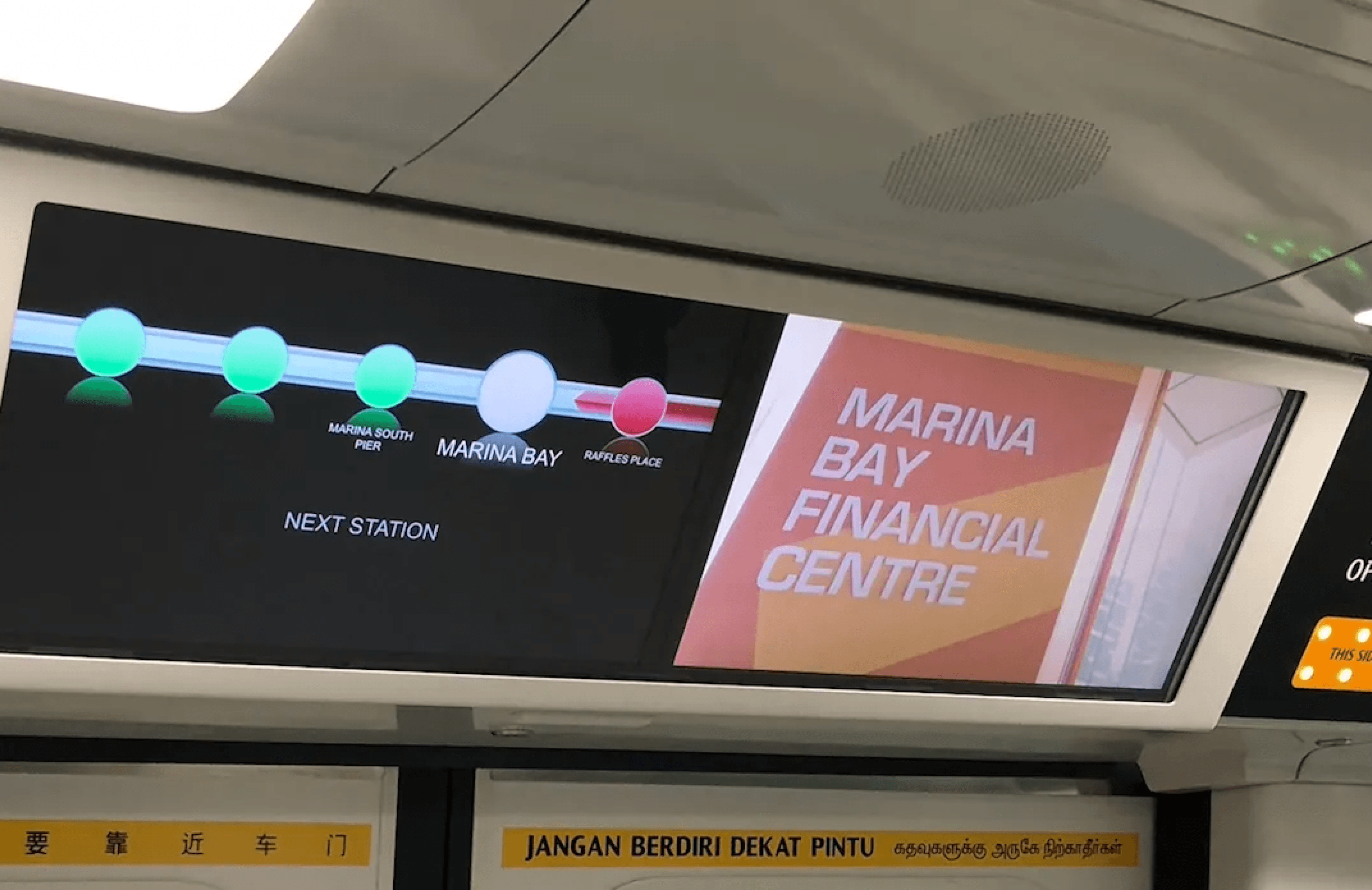
The network map on the screens was underused; commuters preferred the static printed map. Also, abrupt transitions between maps and other content broke continuity.
Blueprint-style layouts of stations appeared for only a few seconds, leaving commuters no time to interpret them.
Exit markers were difficult to see from a distance, reducing their usefulness
Distracting animations and competing signals
Animated arrows and frequent refreshes of the “next stop” section created visual noise instead of guiding attention.
These animations often competed with operational cues such as “Doors Opening,” leading commuters to wait on the wrong side before switching at the platform.
Poor readability
Station names were set in thin, all-caps typefaces that reduced legibility, especially against dark or patterned backgrounds.
Important details like station names were smaller than decorative elements (e.g., station “dots”).
SMRT used fonts resembling Arial Thin and Calibri instead of the official LTA typeface (Oceans Sans), causing inconsistency with other MRT signage.
Design Decisions
Prioritise essential information: Provide users with the current station, next station, interchange lines, and door side. Users should not have to evaluate if the information shown is relevant or wait for multiple screens to flash before they get the information they want.
Simplified information: To display a simple abstract representation of the train platform to know where the escalators are. Avoid overly detailed station maps that require interpretation, reducing cognitive load for commuters.
Purposeful animations and screen transitions: Animations and screen transitions must not distract the user. If they are included in the screens, they must have a purpose and tell the user useful information.
Consistent visual language: Adopted SMRT colours and official typefaces for brand alignment, while ensuring font size is readable from a distance.
HOW IT WORKS
— From Somerset to Marina South Pier
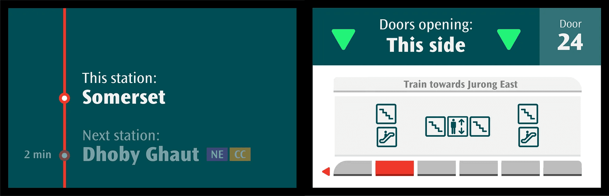
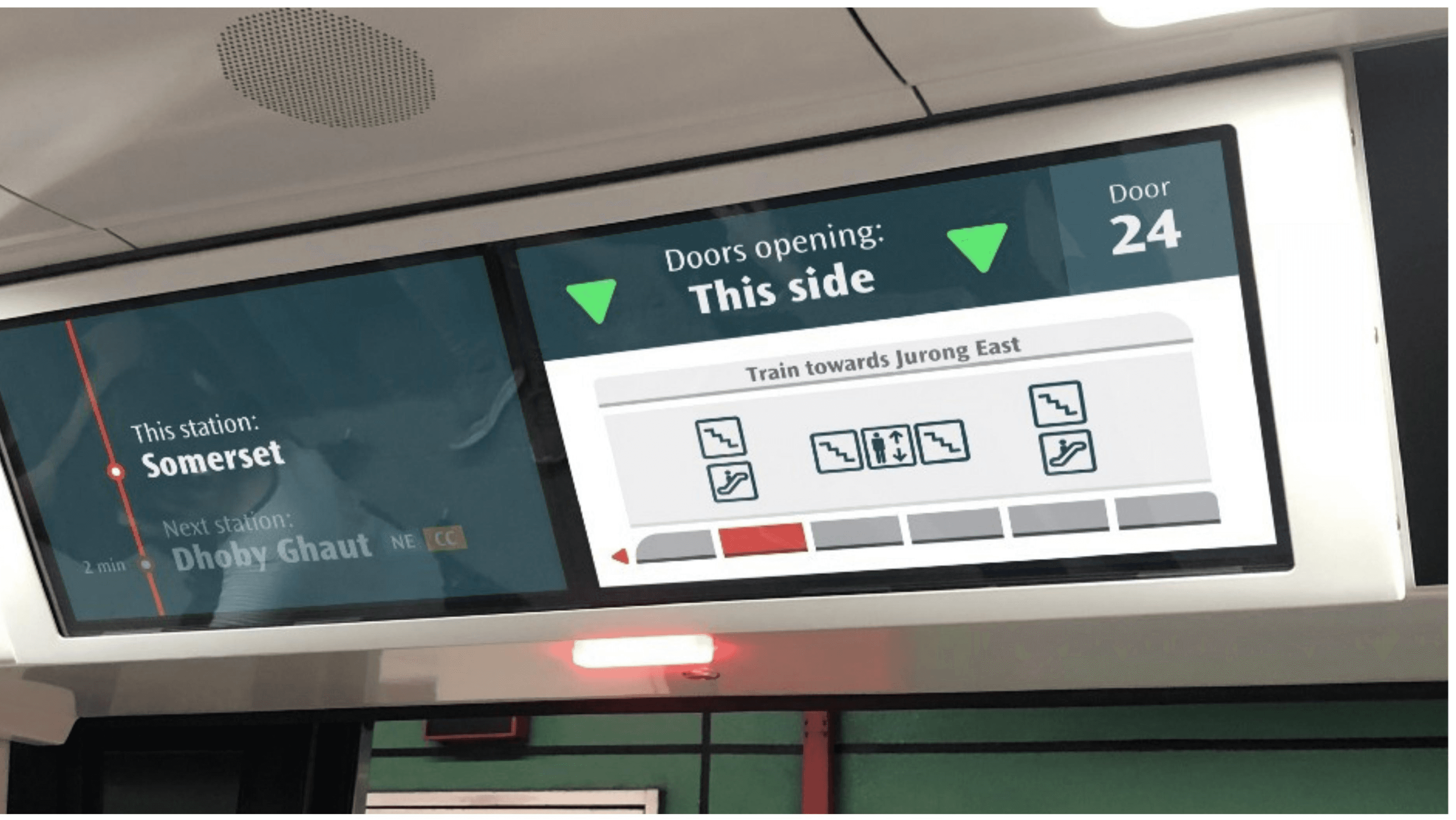
Pulling into Somerset, the key information is clear:
Where you are (Somerset),
What’s next (Dhoby Ghaut),
Which lines to change at Dhoby (NEL and CCL), and
Where the exits are at Somerset.
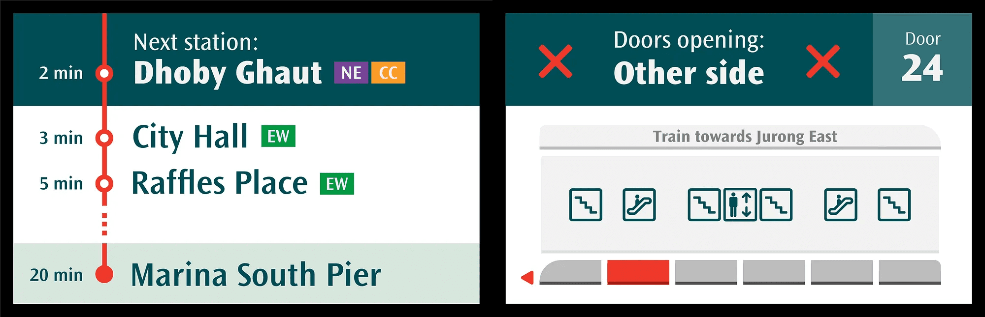
Heading out of Somerset, the display changes to show Dhoby Ghaut’s information, and to give an overview of upcoming stations and the terminus of the line.
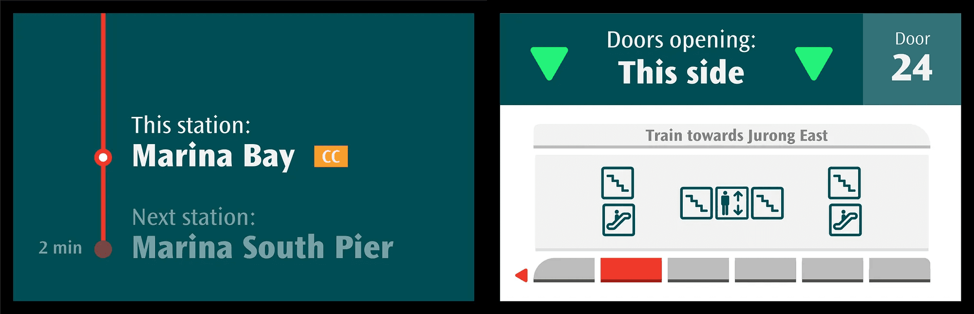
Screen when the train is at Marina Bay Station.
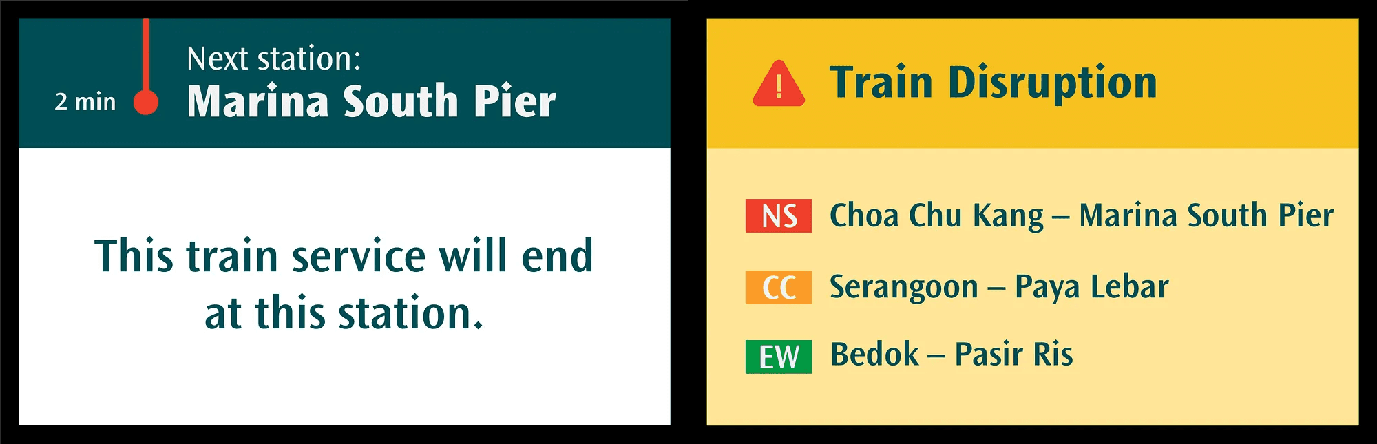
Screen when the train is approaching the last station, as well as when there are train disruptions.
Besides being clear about the end of the line, the screens also give another crucial piece of information for users: disruptions or slowdowns across the system. With ample warning, users can reroute if necessary.
Retrospective
This project expanded my perspective beyond designing digital products, prompting me to think about the entire user journey and all the touchpoints along the way. It motivated me to approach UX as a holistic discipline — considering how physical environments, service interactions, and digital interfaces work together to shape experiences.
One key observation was that even with multiple audio and visual cues — such as station announcements and in-train screens above the doors and in the aisle — many commuters still glance out the train window to identify the station by its interior colour and design. For example, Toa Payoh’s yellow tiling or Orchard’s dark red walls have become intuitive wayfinding cues for locals. This reinforced for me how strong visual identity and environmental design can work alongside digital tools to improve navigation.
More works
E2E Product Design | UI/UX | Nov 2023 - present
Bank's Loan Origination System
Transforming the Bank’s credit journey for Large Corporates by modernising how Relationship Managers (RMs) raise credit applications.
Mobile App | UI/UX | Dec 2021 - Mar 2023
AMEX Wallet Experiences
Enhancing the mobile wallet and payment experiences by streamlining card provisioning, introducing secure features, and exploring new features to deepen engagement.

→