
Aqua Expeditions
Website Revamp
PROJECT OVERVIEW
In 2024, this project was recognised as a Finalist in The Drupal Splash Awards, Corporate Site category. This website revamp reflects Aqua Expeditions' luxury positioning and enhances the online experience for global customers, agents, and returning guests.
THE CHALLENGE
Aqua Expeditions offers ultra-luxury small-ship expeditions, yet their website fell short of reflecting the brand’s high-touch, bespoke experience. This misalignment led to disjointed customer experience that undermined brand credibility and perception.
Key Issues
Information Gaps: Customers lacked clarity around itineraries, booking steps, and what to expect — often resulting in direct enquiries to customer support.
Disconnected Experiences: The transition from browsing to booking to boarding lacked continuity, missing opportunities for personalization and engagement before and after the trip.
This redesign aimed to bridge the digital-physical gap, elevate the luxury perception online and address the business’s key digital goals — included streamlining the booking journey, enhancing personalization for returning guests, and building tools to support agents and loyalty programs.
OUTCOME
These enhancements resulted in a 14% increase in online and direct sales compared to the previous year.
MY ROLE
Conducted site audits of the existing website and performed competitor research to identify areas of improvement.
Provided UX recommendations and research-driven design solutions.
Designed key wireframes for desktop and mobile screens.
Produce desktop and mobile Figma prototypes to obtain stakeholder buy-ins and for usability testing.
Planned and managed usability testing timelines, led usability testing sessions and produced a comprehensive usability report, which was critical to the website’s successful launch.
Content Inventory: Drove stakeholder alignment between design and engineering by defining CMS content needs early, avoiding downstream blockers.
Drive the user-flow walkthrough and provide design support to our in-house engineers.
Collaborated with Matter of Form (MOF — a UK-based agency handling the Brand & UI design) to ensure the UI toolkit provided is scalable & addresses potential edge cases.
Worked closely with MOF by providing design solutions based on feedback from usability sessions.
EXPERTISE
Stakeholder Management
UX Design and Research
Prototype
User Testing
Responsive Web Design
PROJECT DETAILS
Client: Aqua Expeditions
Role: UX Researcher & Designer
Team: 2 UX designers & 4 developers
Collaborated with: Matter of Form on UI Design
Tools: Figma, Hotjar
Timeframe: April 2023 (1 Year)
View Project
RESEARCH PROCESS


What we learned
The current website is convoluted, lacks information and failed to support confident decision-making.
Major Issues
Lack of itinerary information and clarity of the booking process
New customers often reached out directly for recommendations — including flight options to the cruise embarkation point, vaccination requirements, packing suggestions, and available cruise options within a given travel window. Many also struggled to determine how many suites were needed to accommodate their group size.
“I think the issue is that the website does lack information. It's very much like an inspirational website, it gets you excited, it gives you these descriptions of the destinations and, and the ship, but there's no actual facts”
Visuals are important
Most users appear to quickly browse through the content and show a preference for viewing photos and videos as they go through the page. Users want to view more photos of suites & amenities.
“There are different types of cabin and it’s not well presented on the website.”
Confusion around cruise ship offerings
Most users had difficulty differentiating between the vessels and understanding which best suited their travel needs — including factors like suite type, number of windows, room capacity, and available amenities.
“Include few more things related to Accommodation, Capacity and Crew, so that I can know more or less what to expect.”
Translating Insights into Wireframes
We designed low-fidelity wireframes for key flows — main website, booking, and post-booking — across desktop and mobile breakpoints. We tested these with internal stakeholders to align on structure and interaction flow before moving towards prototyping and visual design.
Below are examples showing how user pain points were addressed through mid-fidelity wireframes.


Usability Testing
Prototypes for both desktop and mobile were developed. I planned and led two rounds of usability testing to validate and refine the design direction at key stages of the project.
Round 1: Tested mid-fidelity (wireframe) prototypes
Participants: 4 users (2 desktop, 2 mobile)
Approach: Task-Focus User Testing
Goals:
Validate how easily users could locate key information — embarkation, disembarkation, types of activities
Test assumptions about navigation labels and content structure
Uncover usability friction in itinerary exploration and accessing their account to find upcoming trip or link their past booking(s).
Key Takeaway:
The mega menu was largely intuitive and allowed users to explore the site structure with minimal guidance.
“See All” Button Confusion: This element consistently caused friction — users either overlooked it or misunderstood its purpose.
The submenu is not easily noticeable, but its functionality aligns with users’ expectations once discovered.
Terminology: Users were unable to relate the term 'Aqua Experience' with Aqua's offerings / brand values.
Interactive Deck Plan encourage discovery but interaction prompts can be improved.
Stakeholder Insight:
While users generally found the mega menu intuitive, some stakeholders expressed a preference for a burger menu on desktop, believing it would better reflect the brand’s clean, luxurious aesthetic. This insight led us to include A/B testing in Round 2 to evaluate both user interaction and brand alignment.

Screens from the mid-fidelity wireframe prototype used in Round 1 user testing
🤝 Handoff: Wireframes to Matter of Form (MOF)
Before transitioning into visual design, we facilitated a structured handoff to MOF, Aqua’s UI and branding partner.
We reviewed the scope of work defined in MOF’s client contract.
Conducted a walkthrough to provide design rationale and highlight key interactions envisioned for user experience.
Delivered 24 wireframe components to ensure clarity, consistency, and scalability.
Round 2: Tested high-fidelity (UI) prototypes
Participants: 12 users (8 desktop, 4 mobile)
Approach: Task-Focus User Testing, Comparative Usability Testing & Impression Testing
Focus:
Validate that visual enhancements further support the site’s user experience
Identify any remaining friction introduced by real content, images, and interaction elements
Run A/B testing for burger navigation vs traditional top navigation on desktop
Assess whether the new design effectively conveyed Aqua’s luxury brand positioning through first impressions
Key Takeaway:
Mega Menu Preference (Desktop): Participants responded more positively to the mega menu compared to the burger menu, citing ease of exploration and better visibility of options.
Homepage - Mapping Vessels to Destinations (Desktop): Participants found it challenging to correlate vessels with their respective destinations, often needing to scroll back and forth across sections.
Itinerary Sorting Preferences: Participants expressed a preference for browsing itineraries by time period rather than destination alone. Given the advance planning typical for cruise bookings, a time-based filtering option would better align with user needs.
Interactive Deck Plan Reception: Most participants engaged with the Deck Plan feature and found it useful for identifying interconnecting suites and understanding the ship layout.
Scrollability Challenges (Mobile): Several mobile users struggled to recognise horizontally scrollable sections. Pagination indicators were outside the visible screen frame or not visually distinct.
“Book Now” Visibility (Mobile): Despite being designed as a sticky, high-emphasis element, the “Book Now” button in the mobile menu went unnoticed by most participants.

Usability Test Planning & Report
Revamping the solutions after user feedback
Below are examples of changes made in response to usability findings — from language refinement to structural shifts in visual hierarchy.


Retrospective
THE CHALLENGE
Midway through the project, resource restructuring meant I took over as lead from the wireframe stage through to developer handoff. The timeline was tight, requiring careful coordination between multiple parties. Coordinating with both the client’s newly hired content writer and MOF — whose scope included delivering 24 design patterns — meant setting and maintaining firm milestones to keep content creation, UI design, and wireframe development in sync. This, along with shifting priorities and dependencies, required adaptability and proactive communication to prevent misalignment.
Key Learnings
Structured workflow: Established a clear system for organising work-in-progress, including directory structures linking relevant screens and colour-coded labels to track content status.
Designing for usability testing: Built targeted screens and prototypes to focus stakeholder discussions, clarify requirements, and test specific hypotheses effectively.
Collaboration dynamics: Learned the importance of proactive communication to surface assumptions early and maintain alignment across stakeholders.
Content inventory for CMS: Guided the client in setting up a content inventory system that supported developer needs while matching the client’s expectations for the CMS.
More works
E2E Product Design | UI/UX | Nov 2023 - present
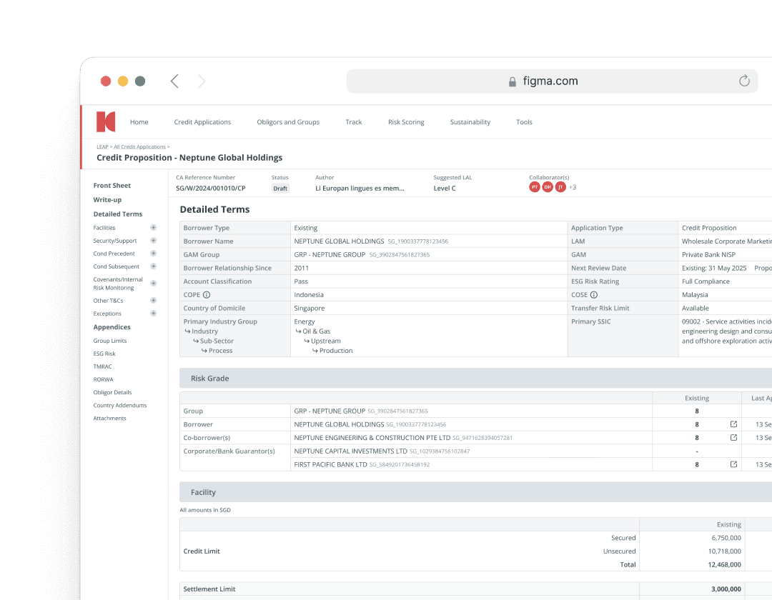
Bank's Loan Origination System
Transforming the Bank’s credit journey for Large Corporates by modernising how Relationship Managers (RMs) raise credit applications.
Mobile App | UI/UX | Dec 2021 - Mar 2023
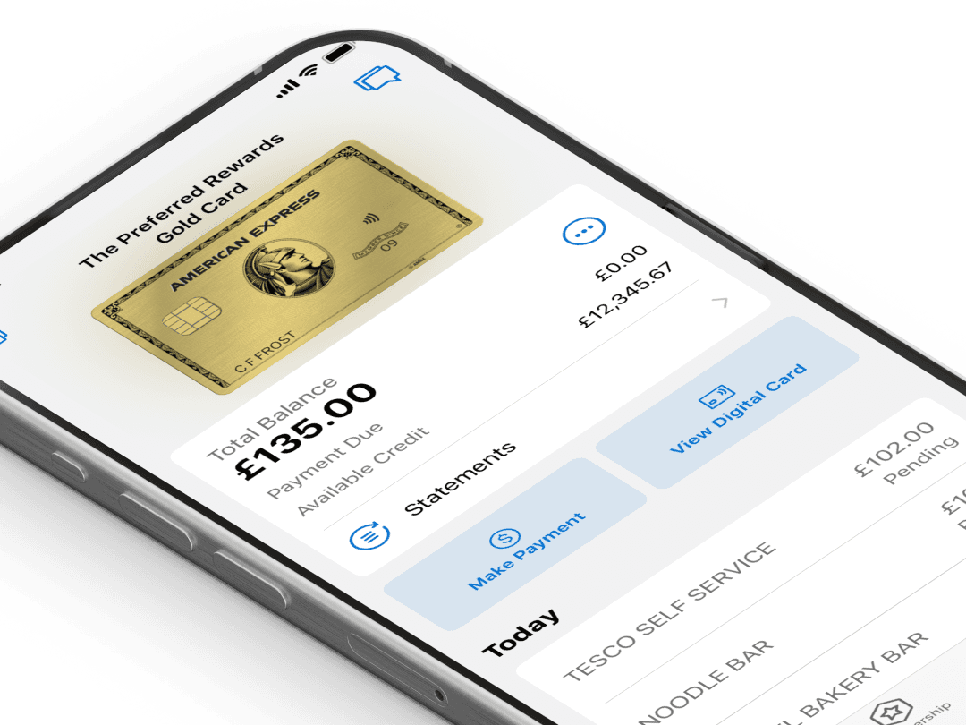
AMEX Wallet Experiences
Enhancing the mobile wallet and payment experiences by streamlining card provisioning, introducing secure features, and exploring new features to deepen engagement.

→